
Ornatus-Mundi
[Zenith]
7136

Zenith Coffee House Tales (vii): Back to the Future - the El Primero Stratos Flyback Rainbow
With the newest edition of the Zenith Coffee House Tales I would like to present the Zenith El Primero Stratos Flyback Rainbow watch as the other example on how the brand is trying to reconnect with its vast heritage and attempting to draw inspiration thereof. To fully understand the essence of this edition of our coffee house conversation I strongly suggest to read episode (v) on Zenith's El Primero 1969 model (the 'faithful' approach, click here! ). It highlights a very different approach to a similar end.
Like in all previous examples this story could have not been realised without the tremendous support by Zenith Austria's Miss R who not only brought along the current El Primero Stratos Flyback Rainbow but also as essential comparator the 'vintage' Rainbow Flyback version from the 1997:
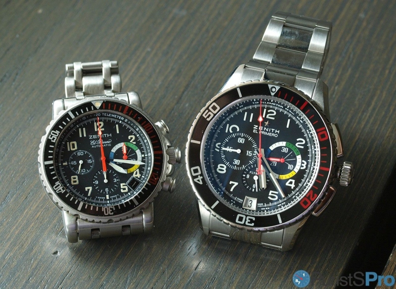
Isn't it amazing to see so clearly how tastes and preferences have changed? 39 vs 45.5 mm, and much more!
Clearly, this is a prime example which teaches us a lot about the areas of attention as well as the general path of the industry during the last 20 years. To sum it up, the original piece is made like an instrument, whereas thus current Stratos is inspired by an instrument. A tiny but consequential difference!
The front with dial and hands:
The 1997 version does little to hide its tool-like appearance. Size, features and presentation are of high technical quality and designed with the goals of robustness, legibility and longevity in mind.

The design of bezel and dial are such that the important information is always visible at a glance: the numerals pronounced, a strong contrast between hands and the dial. Note how the deeper rims at the 5 min indications of the bezel provide a tactical guide to the user! Less important information such as the date, the permanent seconds or the hours counter move to the background.


The minute counter however is emphasised with a larger subdial (thus 'eating' the 3 o'clock numeral) and what many refer to as a 'aviation colour code' (if such indeed exists). Regardless, it provides a very useful 5min differentiation aid. The hand gets a red painting that is shared with the seconds counter.
Note the flat crystal with its typical (for the turn of there century) antireflective coating:

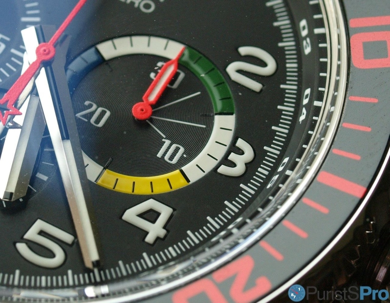
A closer look at the minute counter reveals a fascinating detail: the yellow, green and blue segments look almost radially brushed whereas such pattern is absent from the remaining white areas - are they hand-painted? It occurs to me that this might provide another visibility aid:

Overall, the entire front face of the watch gives a flat appearance throughout which is only penetrated by a step flange carrying a telemeter scale. Very tool-like, very appropriate!


A closer look at the minute counter reveals a fascinating detail: the yellow, green and blue segments look almost radially brushed whereas such pattern is absent from the remaining white areas - are they hand-painted? It occurs to me that this might provide another visibility aid:
Overall, the entire front face of the watch gives a flat appearance throughout which is only penetrated by a step flange carrying a telemeter scale. Very tool-like, very appropriate!
Contrast this to the current Stratos Flyback Rainbow:
Zenith has opted to keep the overall colour scheme, however, I cannot deny the notion of 'function follows form': Numerals are smaller, the permanent seconds received as much importance as the minute counter (now both 3 and 9 o'clock indices are 'bitten') which certainly helps designed achieving a more 'balanced' layout, but at the expense of technically more appropriate indications. Also the date stands out more.
Strikingly the watch does almost completely away with the original flatness in favour of a strong relief-like design. Moreover, if you look carefully at the numerals it appears as if they carry something like a Sabattier effect:
"This effect is create by re-exposing film negative or plate to light again part way through the development process. The resulting image is given both positive and negative qualities. The effect was not described correctly by Sabattier until 1862.However it wasn't until the 1920's, the Surrealist Man Ray was to perfect the technique to create an oneiric dream-like state for his portraits and nudes. The process had been accidently discovered by his assistant Lee Miller, who later became the famous American surrealist photographer, in his darkroom..."

"... For Man Ray, the important characteristic is the Mackie line, which marks the boundary between adjacent highlight and shadow areas. Most early photographers who accidently created this effect would have thrown the print away, but for Man Ray, this was a way of making the photographic image strange and bizarre by creating a new order of reality." [Alastair Wallace about Man Ray's usage of the Sabattier Effect]
Indeed, this is achieved by choosing numerals cut of solid Luminova blocks and mounting them on the dial framed with strongly contrasting frame. Like in the solarising technique in the context of photography a local high contrast situation is achieved which is responsible for the said effect.

If the 1997 originally was born probably in the Netherlands, the Stratos version is certainly a child of the alps! Just imagine the numerous 3D elements at the subdials, but particularly at the bezel. Its concave like a theatre mezzanine. It lacks the concise minute segments as well (but thankfully retains the groves for the 5 min positions).
The detailed images below show the care Zenith applied when designing the minute counter: as with the original watch there are alternating coloured segments. Even in the modern version the signal colours stand out also in terms of surface treatment. Here in a literal sense as they are realised with an extra thick layer of paint:

Overall, I found it a refreshing and in details fascinating contemporary interpretation of a classic watch theme. Its makes a few compromises on the technical/usability aspects, but adds a lot more in terms of finishes, usage of space and materials. Well done!

Case and case back:
Two entirely different timepieces, the one by today's standard so diminutive that it almost appears as if it would crawl into the modern's arms for shelter:

The entire case of the original Rainbow is presented with a matte finish which extends to any detail including the lugs, the pushers and the crown guards.

Note how Zenith has tried to achieve a uniform design with pushers and crown:

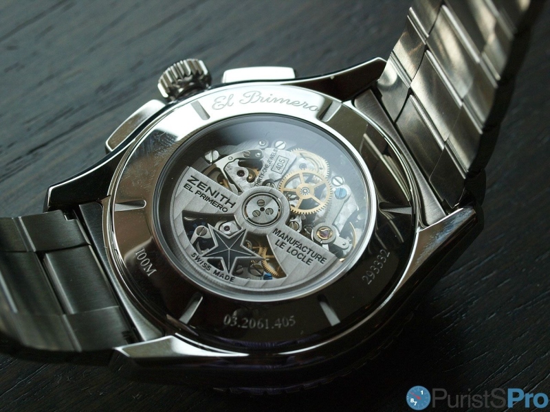
On the back we see a solid cover, which is adorned with a very nicely executed engraving and which sports two different finishes: polished centre surrounded by a brushed main section.

Contrasting to that in the literal sense is the case finishing of the Stratos version: polished, very clean lines, with pushers doubling as crown guards. The streamlined design is not without intriguing detail-work as exemplified with the star on the crown.

The overall case appears much flatter in construction than its ancestor, however, it is indeed 2mm thicker (14 vs. 12mm). Of course Zenith chose to exhibit its landmark movement, the Zenith El Primero Flyback Cal. 405 B:
Wearing the pieces:
Contrasting to that in the literal sense is the case finishing of the Stratos version: polished, very clean lines, with pushers doubling as crown guards. The streamlined design is not without intriguing detail-work as exemplified with the star on the crown.
The overall case appears much flatter in construction than its ancestor, however, it is indeed 2mm thicker (14 vs. 12mm). Of course Zenith chose to exhibit its landmark movement, the Zenith El Primero Flyback Cal. 405 B:
Wearing the pieces:
After my description above it would come as a surprise if the wearing experience would be (close to) identical. Indeed, the two watches wear like totally different animals. First the original:

Its sits almost tender and tiny (by today's tastes) on your wrist, but at the same time does not fool you about its made-for-purpose technical character.

Its legibility from almost any angle is remarkable and largely due to the excellent contrast and a low propensity to flare.
The modest dimensions of the 1997 Rainbow are most charming in the sense that they are recognised as a 'condensed sexiness' - at least by me!

While the style and execution of the brushed steel bracelet identifies it certainly as a child of turn of the century, it is indeed very comfortable on your wrist and carefully to your hair ;-)

Judging from what outstanding bracelet we are used these days the design is a but rough, but it matches nicely to the watch.

17 years alter, a descendant exercises its seducing power... as a fundamentally changed watch which still thrives on the merits of the original one.

While the style and execution of the brushed steel bracelet identifies it certainly as a child of turn of the century, it is indeed very comfortable on your wrist and carefully to your hair ;-)
Judging from what outstanding bracelet we are used these days the design is a but rough, but it matches nicely to the watch.
17 years alter, a descendant exercises its seducing power... as a fundamentally changed watch which still thrives on the merits of the original one.
Large diameters are the norm, but who would have thought that the same movement with the same position of the subdials would still 'work'?

The Zenith Stratos Rainbow perfectly reflects on how the industry conceptualises a 'tool-watch' in the modern luxury watch market: emphasis shifted from tool to luxury, without neglect of the tool-like specifications. they are there, fully usable, but clothed in finest drapery.

I cannot deny that I really love the outcome, something I was not so sure about. There is just one thing...

... which I already mentioned: the bracelet. In terms of style and finishing well above of what the 1997 model has to offer, but still out of earshot of the very best.

If you carry at least as much hair in your wrist as I do, you will be reminded that there are better ones on the market - you know what I mean!

I really would urge Zenith to address the hair-eating behaviour of the bracelet - then it would be perfect, particularly since it is such a nice complement to the watch!

So there we are - again with a time warp experience. This time spanning only 17 years, but with a much more fundamental change in conceptualisation than with the El Primero 36000 BPH 1969 we considered recently.
With this pair here one cannot simply opt for one or the other, in principle you need both to have a complete collection (as far as the Rainbow goes, that is ;-)). They are very much the same but fundamentally different likewise.
I was quite skeptical whether the Stratos would work for me, but I have to admit that I am seduced. The manufacture had a much more difficult task to look back and develop the future compared to the 1969: A classic and elegant timepiece can more easily be modernised (its a classic after all!), but sports (or tool) watches a much more designed in their respective societal, design and preference context.
Thus, what worked a decade ago might be totally inappropriate today. The fact that Zenith modified so much in only 17 years is a testament to this.
The fact that they (in my opinion) succeeded is a testament to artists in Le Locle and the management which apparently has well understood to identify the essence of a timepiece and transform it into something contemporary and desirable!

Thanks for reading,
Magnus
----------
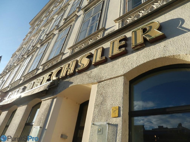
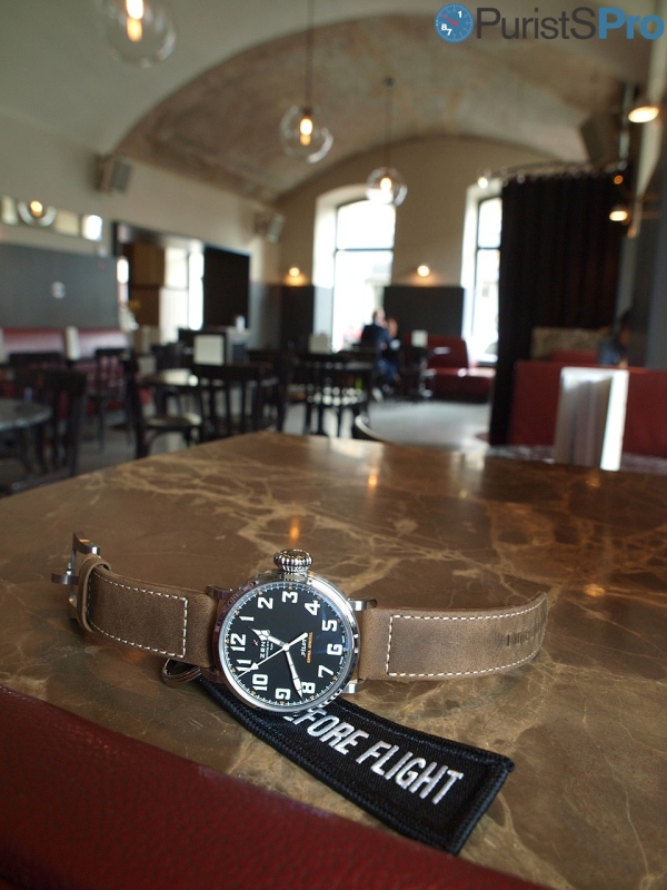
Our location: Café Drechsler, Vienna
The Café Drechsler is a famous (and very lively) institution in Vienna. The current interior was designed after extensive renovations in cooperation with Sir Terence Conran and features polished marble bar and table tops, Bauhaus light fixtures and whitewashed timber panels – stylish yet still distinctly Viennese.
It used to be a melting pot for all sorts of patrons, from actors of nearby theatres, business people or simply the city's street wipers - all sit on the same table, no questions asked.
The Café Drechsler used to close each night for only 1h - so you most likely met those who were still awake and those who were already awake...
More posts:
Zenith Coffee House Tales (vii): Back to the Future - the El Primero Stratos Flyback Rainbow
With the newest edition of the Zenith Coffee House Tales I would like to present the Zenith El Primero Stratos Flyback Rainbow watch as the other example on how the brand is trying to reconnect with its vast heritage and attempting to draw inspiration the...

I miss my "vintage" Rainbow
Perfect balanced, cool case, El Primero inside. The new one is part of the gigantic phase that Zenith is delivering. Too big for my average sized wrist. Congratulations for the post. Very illustrative comparison. Cheers, Nilo
Thanks Nilo, and I would be surprised if YOU...
would chose anything else than the original ;-) Best, Magnus

Another great coffee house tale, Magnus! :)
Thank you, I really enjoy this series! :) The new Rainbow is a monster! Huge! I prefer the old version size. As for the design of the new one I really like the more centered dial with overlapping sub-dials. The date at 6 is not a favorite location, especi...

Excellent post as usual.
To make a long story short, I have mixed emotions with the Stratos Flyback Rainbow. It is obviously a great watch but its size is too large for my taste... and for the EP movement. Anyway, your article is excellent and it was a pleasure to read it. Fx

Choosing one of the Zenith Stratos Flyback Rainbow
Magnus, Thank you and Ms R for the discussion. I used to accept all sizes of watches but as I got older, my preference is now for function over form. Inevitably, that function determines the ideal form anyway....so there is no loss of aesthetic merit. Thu...
Functionally there is definitely no reason to increase the size...
but marketing-wise I think it is ;-) Another aspect of watchmaking... Cheers, Magnus

I prefer the smaller size of the original one, but
love the crown, pushers and bracelet of the new one.
All of the above plus the apparent thinness of the watch...
which is clearly visible here: 'Apparent' because in fact the watch is thicker then the original - but extremely carefully designed. Best, Magnus ...

The legend goes to
the first Rainbow flyback. Thanks for the very nice review and comparison of the two watches. For me the latest reincarnation of the Rainbow fits well in today's trends of watch manufacturing. Contrasted to a true pilot watch which the original one was de...
Reflecting today's trends of watch manufacturing - yes, I think so!
and I guess this is essential in order to attract buyers. Zenith was a mere wallflower over much of its recent history, thus - besides us - very few potential buyers care about the original watch, I think, and are more interested in an attractive modern w...

Another great post! i prefer...
the old one. size is more elegant. also prefer the pushers and the bracelet on the old one. then there's the date placement which i think i better executed on the old one. nothing really compelling about the newer model unless maybe your wrist size is mor...
Thanks Echi, I appreciate the contemporary version...
as it is a true representative of today's 'tool' watches. More luxury than tool, just look at the Blancpain 50 Fathoms, for example. Cheers, Magnus

The most telling difference . . .
. . . other than size might be the shift in symmetry. The original evinces slanted symmetry with identically sized constantly running seconds and chrono hours counters at a 45º angle to the center line, accentuated by date aperture placement ~ 120º from t...
Absolutely, Art, and I think the slanted symmetry...
adds much to the charm of the old piece. Magnus